When you have a booth at a wedding show, you have a 3- to 5-second window of opportunity to let attendees know who you are, what you’re offering and what benefits you can provide to them. If your in-booth graphics are effective, people will take the time to stop and talk to you about your services. If they aren’t…well, you won’t be talking to many people.
How do you ensure your in-booth graphics work and help you stand out from the rest of the wedding show crowd? Here are 5 of the most common graphic mistakes you should avoid:
1. Too Many Words
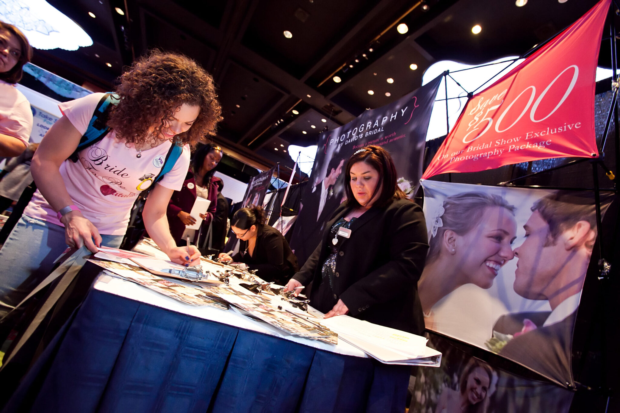
If your text takes more than 3 seconds to read, then it’s too much text. Your in-booth graphics should have no more than 6-10 words. Instead of extra words, use an interesting image that reinforces your message.
2. Impressive Images
Less is more where images are concerned. Use one large, main image for your in-booth graphic instead of several smaller images. Also, always use a high-resolution image as it will make a high-quality impression.
3. Competing Colors
Text color needs to provide a sharp contrast to the background if you want it to be easily read. Effective color combinations typically include dark black, blue or green text on light color backgrounds. And definitely avoid busy backgrounds, where the text will get lost.
4. Tiny Type
Have you ever tried to read a sign with tiny type? It’s nearly impossible! Type should be 1” for every 3’ you step away from it.
5. Funky Fonts
You might love some of the artsy fonts, but they can be difficult to read. Stick to clean fonts and let your images be your art.
If you’d like to learn more about what else you can do to raise awareness of your business, send an email to info@greatbridalexpo.com and we’ll have one of our Bridal Marketing Specialists talk you through what’s possible!
